Brand Identity / Website / Webflow Development
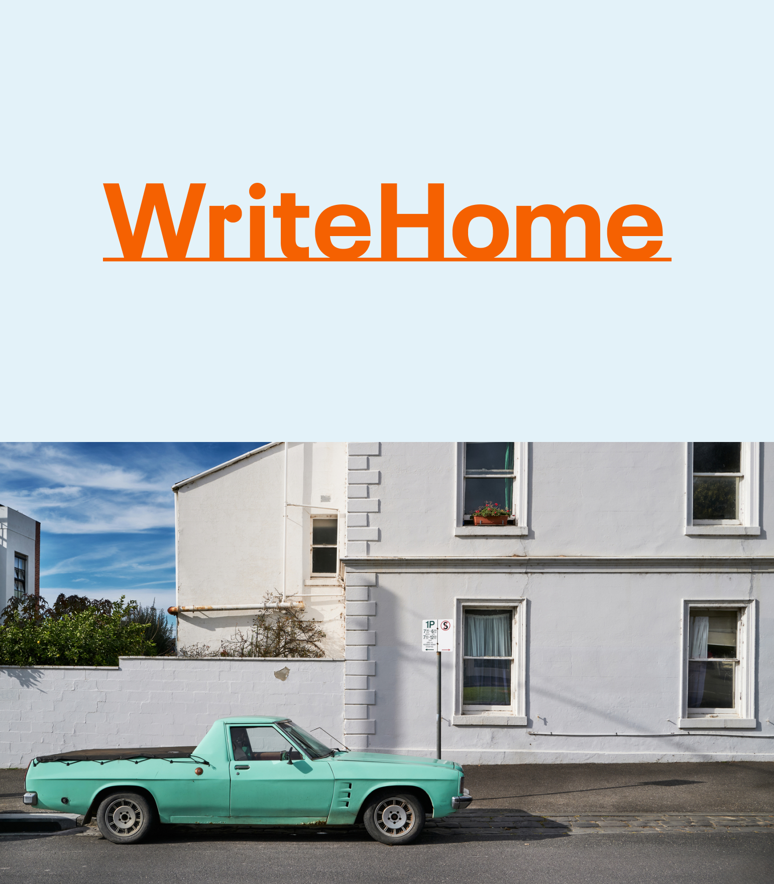
BRAND IDENTITY
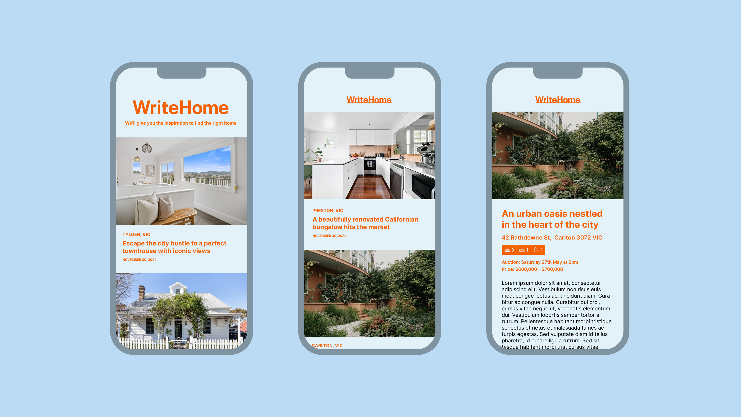
WriteHome is an online editorial platform with a goal of featuring property listings that are accessible for everyday people. WriteHome is a play on the words “right home", acknowledging that the right home is different for everyone.
The brandmark is warm, friendly, and stable, evoking the feelings of home. The underline references a line of writing but also the ground upon which a home is built.

WEBSITE DESIGN & DEVELOPMENT
The WriteHome website was built on the Webflow platform to leverage the user-friendly CMS and custom fields. The site, being editorial, will be used regularly by multiple contributors on the WriteHome team, so it was important that it was easy to use. Before I could roll out the look and feel of the brand identity, I had to design a database schema including all data points and create wireframes of where and how the data would be looped and filtered. I also integrated some additional functionality, via the Webflow dev community, to elevate the user experience.